
PHS Drama Club
Little Shop of Horrors
For the third year now I volunteered to work with Portland High School on creating the poster spring musical. This year is was for their March 2020 performance of Little Shop of Horrors.
From the director's request: “Skid Row (the setting) is a really really crappy part of town - so I'm aiming for crumbling and rotting, abandoned, forgotten - Urban decay." She also mentioned wanting a monochromatic palette because "the world of the play is pretty boring until the man-eating plant arrives from outer space." The main source of color is the plant. I wanted to blend the urban decay feel with a 1950's style poster...ending up with a graffiti/run-down alley look.
I carried the monochromatic palette into the program. This year was the first year advertisements have been sold, and they are the main source of color.

PHS Drama Club
Peter and the Starcatcher
I was excited to work with Portland High School on creating the poster for their March 2019 performance of Peter and the Starcatcher.
The director's vision was a “kids fort meets pirate ship” feel. I wanted to build upon that, so the poster uses blocky and handwritten fonts. I also overlaid a paper texture over the entire poster to give it a construction paper feel.
I carried the same feel into the program by using a handmade paper texture of the clouds as the page background.
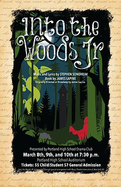
PHS Drama Club
Into the Woods Jr.
I was excited to work with Portland High School on creating the poster for their March 2018 performance of Into the Woods Junior. I wanted to incorporate the "storybook" feel of the show, so the frame is text from the opening number. I made a point of matching some of the set design features in the design of the poster, keeping the dark feel of the woods. I'm very pleased with the outcome.
I also design and created the program for their performance. I carried the "storybook" feel from the poster over to the program, incorporating the same aged paper background throughout.
From the Director, "We are so happy with the poster and program - by far the most professional publicity we have ever had. I was impressed with the way you took my set design and show concept and ran with it- so much more than I could have imagined. Couldn't be more satisfied!"